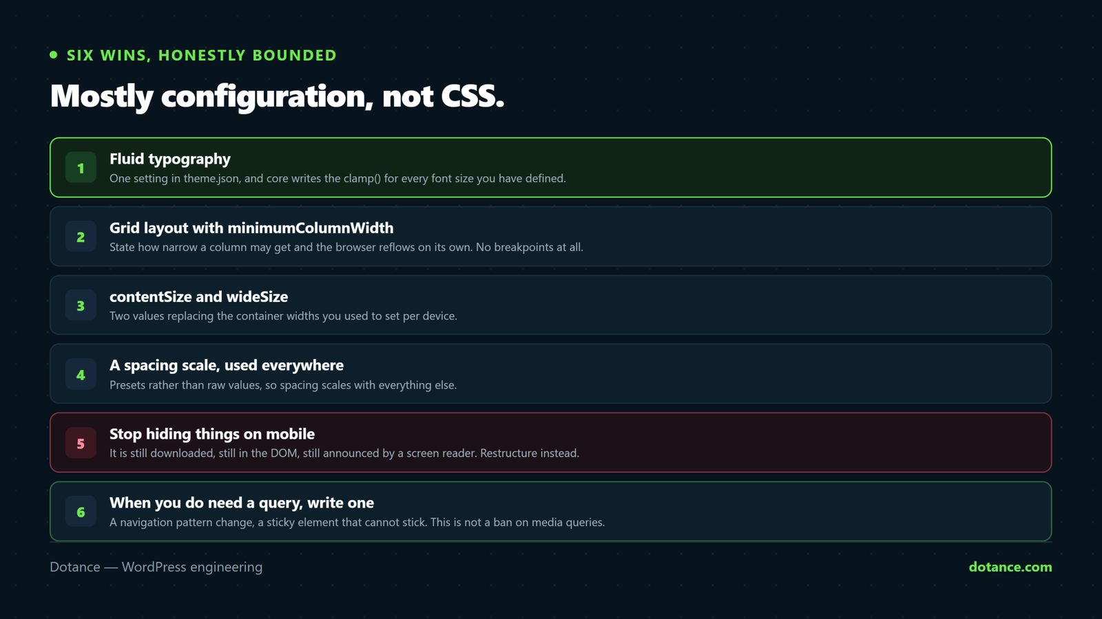
Most people reach for a page builder because setting three values per breakpoint in a visual panel is easier than writing media queries. That was a fair trade in 2019. In 7.1 it is a worse one, because the best WordPress responsive styling now comes from telling the system your intent once and letting it compute the rest. Here are six things you can do today without a builder, and the places where a builder is still the right answer.
What changed in how WordPress responsive styling works
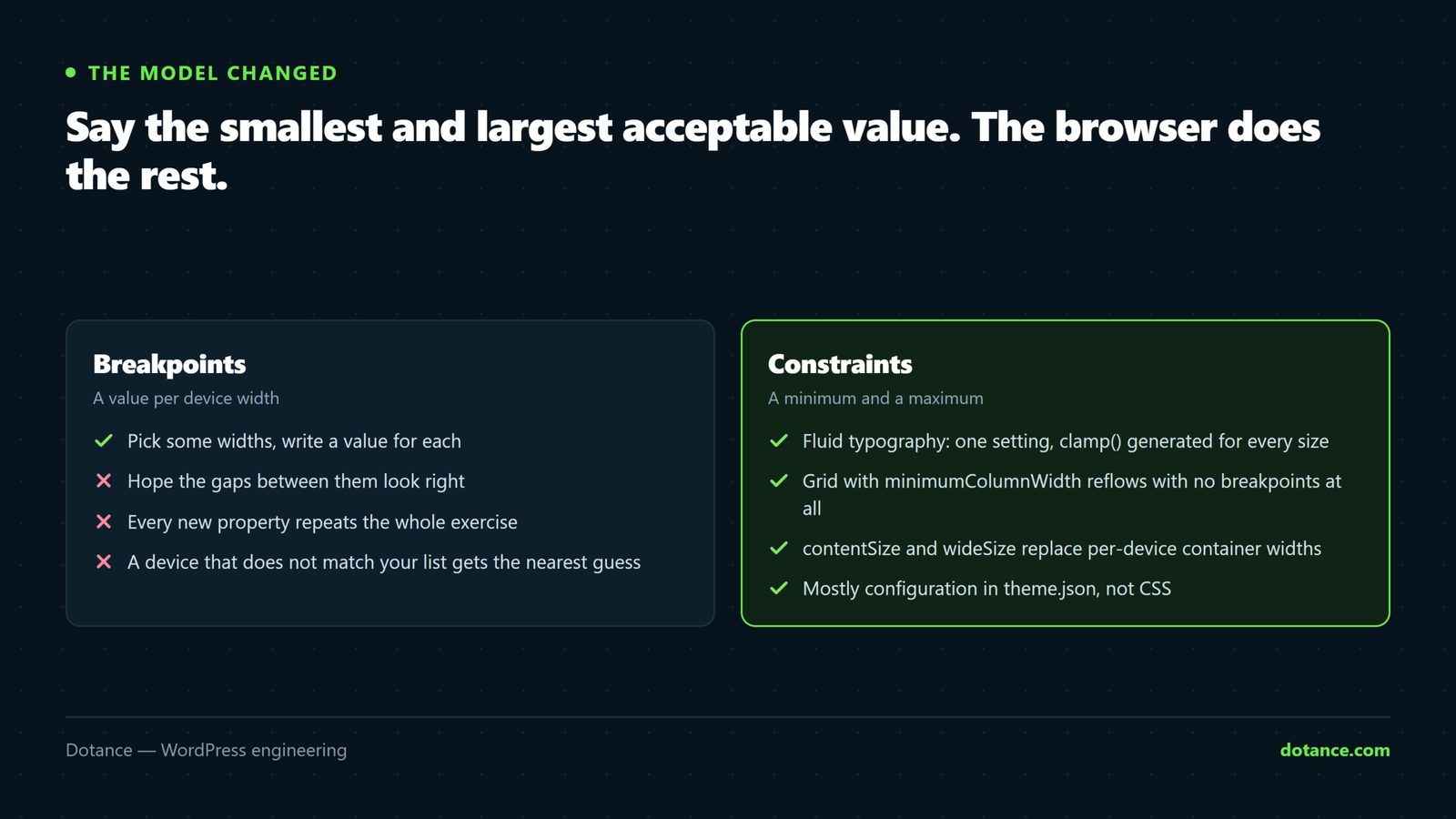
The old model was breakpoints: pick some device widths, write a value for each, hope the gaps look acceptable. The new model is constraints — say the smallest and largest acceptable value and let the browser interpolate.
| Old approach | 7.1 approach |
|---|---|
| Font size per breakpoint | Fluid typography, one min and one max |
| Column counts per device | Grid layout with a minimum column width |
| Container width per device | contentSize and wideSize |
| Padding per device | Spacing presets that scale together |
| “Hide on mobile” toggles | Layouts that do not need hiding |
The practical upshot is that good WordPress responsive styling stops being a per-page chore and becomes a theme setting you write once. That is also the honest downside, covered at the end: you get less control over any individual breakpoint in exchange.
Win 1: fluid typography is WordPress responsive styling in one line
This is where WordPress responsive styling starts. Turn it on globally and core generates a clamp() for every font size in your palette:
theme.json
{
  "version": 3,
  "settings": {
    "typography": {
      "fluid": true,
      "fontSizes": [
        { "slug": "medium", "size": "1.125rem", "name": "Medium" },
        {
          "slug": "x-large",
          "size": "2.5rem",
          "name": "Extra large",
          "fluid": { "min": "1.75rem", "max": "2.5rem" }
        }
      ]
    }
  }
}
With "fluid": true, core derives sensible minimums for sizes that do not declare their own. Where you care — headings, usually — give explicit min and max values and the generated clamp() respects them exactly.
This one setting removes most of the media queries in a typical stylesheet. It is the highest-value change in WordPress responsive styling because heading sizes are what actually break small screens, and the old fix — three breakpoints per heading level — was six rules where you now write none.
Set a real minimum on your largest sizes. Core’s derived minimum is conservative and can still be too big for a 360px screen on a long word. Test your longest heading, not your shortest, and set min from that.
Win 2: grid layout that reflows without breakpoints
The Group block supports a grid layout, and the useful part for WordPress responsive styling is minimumColumnWidth — you state how narrow a column may get, and the browser decides how many fit.
<!-- wp:group {"layout":{
	"type":"grid",
	"minimumColumnWidth":"18rem"
}} -->
This is the most under-used tool in WordPress responsive styling. Four cards become three, then two, then one, at whatever widths the content actually requires. There is no breakpoint to choose, nothing to maintain, and it behaves correctly inside a sidebar or a narrow column where a device-width breakpoint would have been wrong anyway.
The alternative, columnCount, fixes the number of columns and is the right choice when the design genuinely requires exactly three across. Use it deliberately, and expect to add a query for small screens — it is the one grid setting that does not solve WordPress responsive styling for you.
Win 3: contentSize and wideSize instead of container widths
Container width used to be three values. Two values in theme.json replace the container width fields you used to set per device:
"layout": {
	"contentSize": "42rem",
	"wideSize": "70rem"
}
Everything inherits. A block at default alignment gets contentSize, a wide-aligned block gets wideSize, and a full-aligned block goes edge to edge. Because the values are in rem and the page is not fighting a fixed pixel container, nothing needs a mobile override.
Pair it with root padding so full-width sections still have gutters:
"useRootPaddingAwareAlignments": trueThat single boolean is responsible for a large share of the “text touching the edge of the screen” complaints in hand-rolled block themes. It tells core to apply your root padding to full-width blocks’ inner content rather than to the page wrapper, which is exactly what you want and is fiddly to reproduce by hand.
Win 4: spacing presets that scale together
Spacing is the quiet half of WordPress responsive styling. Define a scale and use the presets everywhere instead of raw values:
"spacing": {
	"spacingScale": { "steps": 7 },
	"units": [ "rem", "%", "vw" ]
}
Then in the editor, every padding and margin control offers those steps rather than a number field. The payoff for WordPress responsive styling is consistency: sections that share a scale look deliberate at every width, and changing the scale changes the whole site rather than forty pages.
If you want section padding that genuinely shrinks on small screens, a preset defined with clamp() does it with no query:
{ "slug": "section", "size": "clamp(2rem, 6vw, 5rem)", "name": "Section" }Win 5: stop hiding things on mobile
Builder “hide on mobile” toggles are the most-used responsive feature of all and the most damaging. The content is still downloaded, still in the DOM, and still read by screen readers in many implementations — you have paid for it and hidden it.
| Why it was hidden | What to do instead |
|---|---|
| A decorative image crowds the layout | Make it a background, or let the grid drop it below |
| A table is too wide | Wrap it in a scrolling container |
| Too many columns | Grid layout with a minimum width |
| The section is not important on mobile | Then question whether it is important at all |
That last row is uncomfortable and usually correct. If a section can be hidden from the majority of your visitors without anyone noticing, the page is better without it everywhere. Good WordPress responsive styling tends to shorten pages, which is also why it tends to make them faster — see why WordPress sites get slow for what page weight actually costs.
Win 6: when you do write a query, write one
WordPress responsive styling is not a ban on media queries. Some things genuinely need a breakpoint — a navigation pattern change, a sticky element that cannot stick on short screens, a decorative element that must move. The point is not to ban media queries; it is that you should end up with three or four rather than three hundred.
In the theme stylesheet
/* Wide tables scroll rather than breaking the page */
.wp-block-table { overflow-x: auto; }

/* One real breakpoint, for a pattern change rather than a size */
@media (max-width: 600px) {
	.site-header__nav { flex-direction: column; }
}
Keep them in the theme, not in per-page custom CSS. WordPress responsive styling that lives in forty different page settings is the same maintenance problem as a builder, just without the interface.
A worked example: a three-card section
Nothing makes the case for WordPress responsive styling faster than a concrete section. The most common one on any business site is three cards in a row. Here is the same section built both ways, because the comparison makes the argument better than any principle does.
In a builder, that section carries a column count for desktop, a column count for tablet, a column count for mobile, three sets of padding, two font-size overrides and often a visibility toggle. Eleven values, stored in that page’s data, repeated on every page that has a similar section.
The same thing as WordPress responsive styling
<!-- wp:group {"layout":{
	"type":"grid",
	"minimumColumnWidth":"17rem"
},"style":{"spacing":{"blockGap":"var(--wp--preset--spacing--50)"}}} -->
One value that matters: how narrow a card may get before it stops working. Everything else — the count at each width, the type sizes, the section padding — comes from the theme. Three cards on a wide screen, two on a tablet, one on a phone, and correct inside a narrow column too, which the builder version would get wrong because it reasons about the viewport rather than the container.
| Builder section | Core section | |
|---|---|---|
| Values stored per page | Around eleven | One |
| Change the design site-wide | Edit every page | Edit theme.json |
| Behaviour in a narrow container | Wrong — viewport-based | Correct — container-based |
| Survives a theme change | No | Yes |
| Editable by a non-developer | Yes, visually | Yes, but the grid width is a setting |
That last row is the honest cost. A client who wants to nudge the breakpoint themselves can do it in a builder panel and cannot easily do it in theme.json. Whether that matters depends entirely on who maintains the site after you.
Auditing WordPress responsive styling on a site you inherited
Before changing any WordPress responsive styling on somebody else’s build, find out where the responsive rules currently live. There are usually three places and nobody has documented any of them.
- Count the media queries in the theme:
grep -c "@media" style.css. Over about forty and the theme is fighting itself. - Check for a
theme.jsonat all. If there is none, adding one is your highest-leverage first move. - Look at one page’s builder data for per-device values. If they are everywhere, a full conversion is a project, not an afternoon.
- Search for custom CSS in page settings. This is where the undocumented fixes hide.
- Load the site at 360px and write down what breaks. That list is your actual scope.
Do step five first if you are quoting. The technical shape of the WordPress responsive styling matters less than how much of it is visibly wrong, and a site with a clean theme.json and three broken sections is a much smaller job than a tidy-looking one with per-device values on ninety pages.
If the site uses a builder and the layout only misbehaves after an edit, check whether you are looking at a caching artefact rather than a styling fault — that pattern is covered in Elementor changes not showing, and it wastes a lot of time when mistaken for a responsive bug.
Where a page builder still wins
None of this is a case for abandoning your builder mid-project. Three things it still does better:
| Builder advantage | Honest assessment |
|---|---|
| Per-breakpoint control of any property | Real and useful when a client wants an exact look at an exact width |
| Visual editing at each device size | Faster for someone who does not read CSS |
| Device visibility toggles | Bad practice, but sometimes the pragmatic answer to a deadline |
The trade is that builder responsive settings live in page data. Every value is stored per page, so a design change means opening every page, and a migration means losing them. Core WordPress responsive styling lives in one file that ships with the theme and survives everything — the broader version of this trade-off is in page builder or custom theme.
A mixed approach is normal. Set the global scale in theme.json even on a builder site: fluid typography and spacing presets still apply to anything the builder does not override, and you will find the builder needs fewer per-device values as a result.
Testing WordPress responsive styling properly
| Width | What to check |
|---|---|
| 320px | Nothing overflows horizontally. The hard floor. |
| 360px | Your longest heading still fits on three lines or fewer |
| 768px | Grids are mid-reflow — the ugliest width, usually |
| 1024px | Sidebar layouts still make sense |
| 1440px+ | Line length has not run away past contentSize |
| Text zoom 200% | Required for accessibility, and rarely tested |
The 200% row is the one that separates careful work from adequate work. Zooming text without zooming the page is a standard assistive setting, and a layout built on fixed pixel heights collapses under it while a fluid one absorbs it. That is a real, concrete benefit of doing WordPress responsive styling with relative units, and it is covered further in WordPress accessibility.
The 768px row is the one people skip. Tablet width is where a three-column grid becomes two and the leftover card sits alone, and it is the width nobody opens during a review.
Where this goes wrong
| The mistake | What happens | Do this instead |
|---|---|---|
| Fluid type with no explicit minimum | Headings still too large at 360px | Set min on your big sizes |
Pixel values in theme.json | Breaks under text zoom | rem, with clamp() where needed |
columnCount where minimumColumnWidth belonged | Three squeezed columns on a phone | State the minimum width instead |
| Per-page custom CSS for responsive tweaks | Unmaintainable within a year | Theme stylesheet, or theme.json |
| Hiding sections on mobile | Downloaded, hidden, still costing you | Fix the layout or remove the section |
| Testing only in the editor | The editor is not the front end | Real devices, or at least real widths |
Forgetting useRootPaddingAwareAlignments | Text touches the screen edge | Turn it on early, not after launch |
The last row is worth doing first on any new theme, because switching it on later changes the spacing of every full-width section you have already built. It is a five-second setting on day one and a layout review on day sixty.
The global settings and styles handbook is the reference for every key named here, and it stays current with each release — worth a bookmark rather than a memorised list.
Frequently asked questions
Does this work with a classic theme?
Partly. Most of what is described here needs only the file, and a classic theme can ship a theme.json and get fluid typography, spacing presets and layout sizes. What it will not get is the full Styles interface. If you are on a classic theme and happy with it, adding the file is still worthwhile and takes an hour.
Will changing theme.json break my existing pages?
It can change their appearance, which is the point, but nothing is destroyed — the values are computed at render time. Test on staging, because a spacing scale change touches every page at once.
Is fluid typography bad for accessibility?
Not when it is done in relative units with a sensible minimum. The failure mode to avoid is a clamp() built on viewport units alone, which can prevent text from responding to zoom. Keeping a rem component in the middle value avoids it.
How long does converting a site to this take?
A small brochure site, a day. A builder site with per-device values on every page, weeks — and usually not worth doing in one pass. Convert templates first, set the global WordPress responsive styling in theme.json, and let individual pages catch up as they are edited.
Can I still use custom CSS?
Yes, and you should for anything genuinely bespoke. The argument is about volume, not purity — WordPress responsive styling done through settings leaves you with a short, readable stylesheet instead of a long one.
Does any of this affect page speed?
Slightly, in the right direction. WordPress responsive styling done in the theme means fewer stylesheets, no builder responsive data per page and less CSS overall. It will not rescue a slow site on its own.
What about the editor preview at different widths?
7.1’s editor runs inside an iframe, which makes its preview far more faithful than it used to be. It also broke some custom blocks in the process — if yours look wrong in the editor but fine on the front end, that is the custom blocks problem, not a responsive one.
Do the new tabs and details blocks behave responsively?
Reasonably, with the same caveat every tab interface has: a row of five labels does not fit a phone. Keep labels to one word, and see the 7.1 Tabs block for where an accordion is the better pattern.
Where should I start on an existing site?
Fluid typography first, because it is one setting and fixes the most visible problem. Then useRootPaddingAwareAlignments, then replace your widest grids. Those three account for most of the benefit.