
Content-first discovery
We start with what you actually publish and who publishes it. The content model shapes the design, rather than the design dictating what content is allowed to exist.
Build · Design
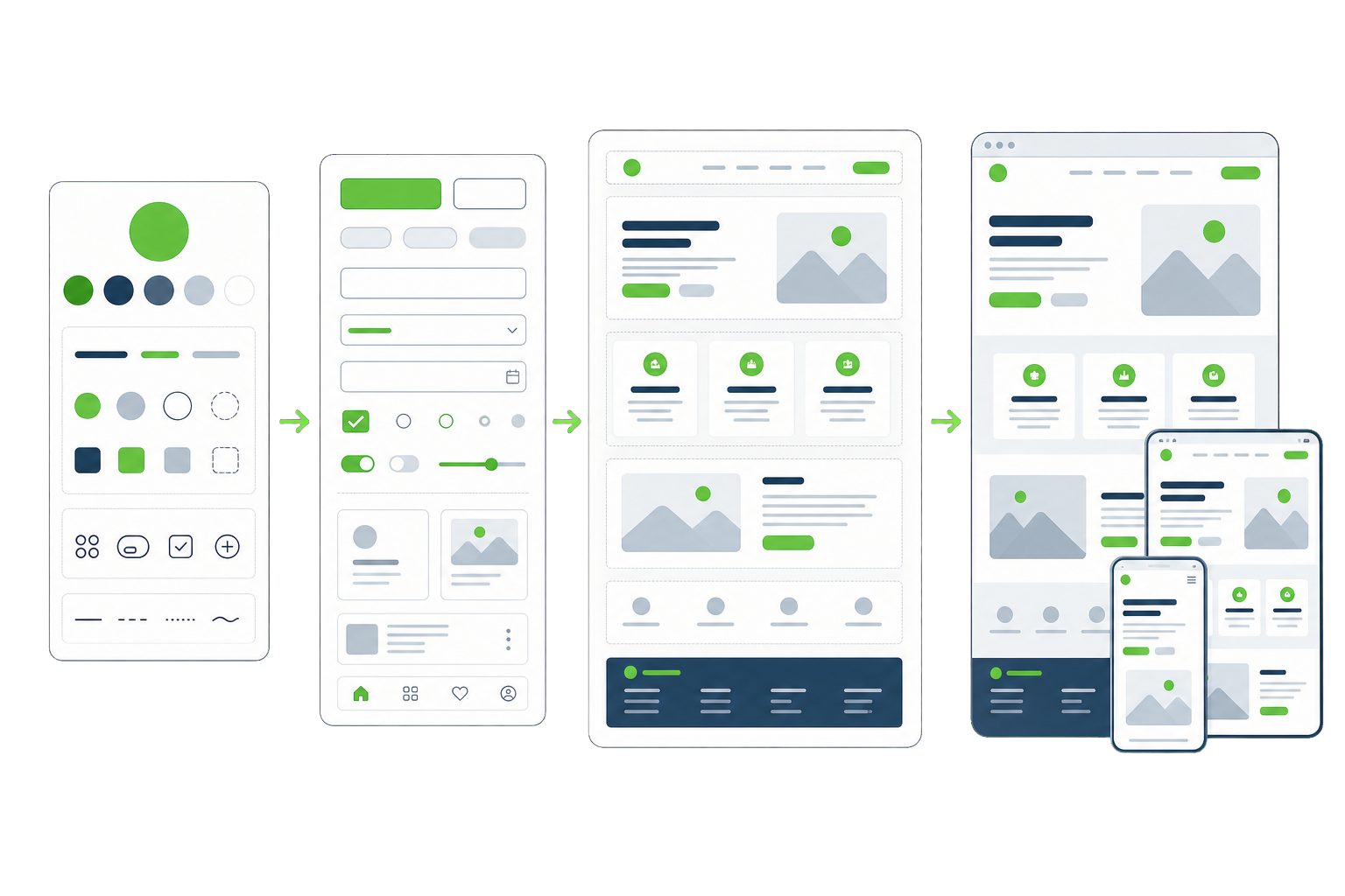
Most agency design ends at a beautiful mockup and falls apart the moment real content and real editors arrive. We design systems, not pictures — so what launches matches what was approved, and still looks right two years later. That is what our WordPress website design work is built to fix.
The problem
What was approved in Figma is not what shipped. Spacing drifted, states were invented on the fly, and the developer filled the gaps with guesses because the design never covered them.
Fourteen button styles, six card variants and three different heading scales. Nobody decided this — it accumulated, one rushed page at a time, until the brand stopped feeling like one brand.
Designed with three-word headlines and perfect placeholder images. Then real content arrived: long product names, missing photos, six navigation items instead of four, and the layout gave up.
Nothing stops someone dropping a full-width image into a narrow section or picking a colour that is not in the palette. Without constraints, the design decays as soon as the team starts publishing.
What we design
We start with what you actually publish and who publishes it. The content model shapes the design, rather than the design dictating what content is allowed to exist.
Colour, type, spacing and radius defined once as tokens, so the site stays consistent and a global change is one edit rather than forty.
Every section your team will ever need, designed as reusable blocks with defined states — so editors assemble pages instead of designing them from scratch.
Layouts designed at every breakpoint, not scaled down and hoped for. Long words, missing images and eight-item menus are considered before build, not after launch.
Contrast, focus states, target sizes and keyboard order are decided in design, where they are cheap. WCAG 2.1 AA is a starting condition, not a remediation project.
Specs, tokens, states and edge cases documented so the built site matches the design. We hand off to your developers or build it ourselves — either works.
How it works
Your audience, your competitors and what your current site is doing to both.
What you publish and how it is structured, agreed before any visual work.
Two or three distinct directions on real content, not mood boards.
Tokens, components and states built out from the chosen direction.
A clickable prototype your team can use before anything is coded.
Documented specs and a walkthrough with whoever is building it.
Results
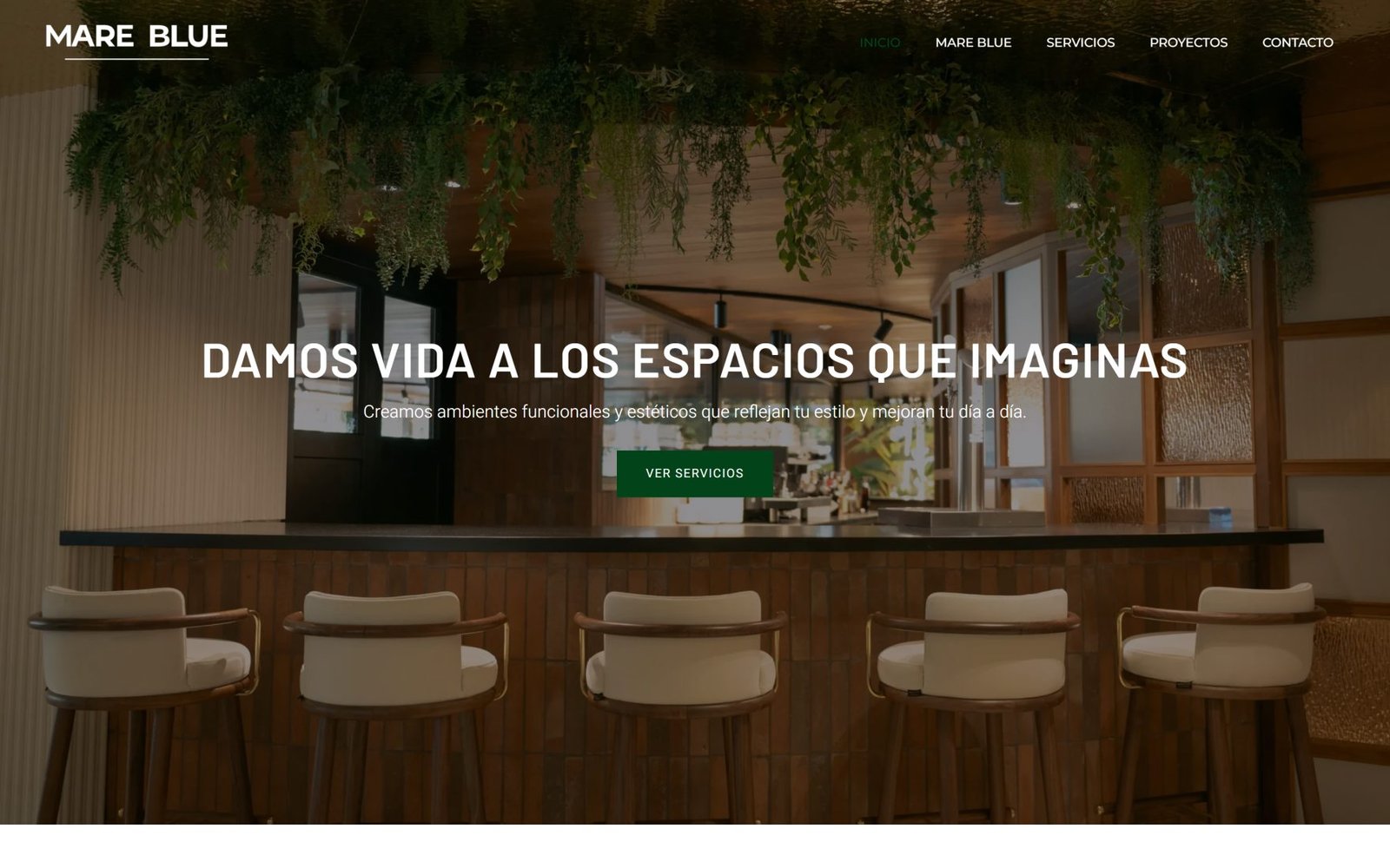
Mare Blue
An integral decoration studio in Spain whose value is entirely visual, with a physical showroom that most enquiries never see before deciding. Built the site as a portfolio first — recent projects and the showroom given the weight the sales conversation actually gives them, with the services written underneath rather than in front.
Capabilities
Engagement
Fixed fee
A focused week or two producing direction, key templates and a component starter set — enough to decide whether the direction is right before committing to a full build.
Fixed price after discovery
The complete system: content model, tokens, every component and pattern, prototypes and documented handoff, ready for build by us or by your own team.
Monthly
Ongoing design support for teams shipping continuously — new patterns, campaign pages and keeping the system coherent as it grows.
Cost
The engagement shapes above say how the work is bought. This is the other half: why two WordPress design quotes for what looks like the same site can be thousands apart, and which of those differences are worth paying for.
Thirty pages built from five templates is a smaller design job than fifteen pages that each need their own layout. Count the genuinely different page types — it is the number the design effort follows.
Designing against real copy and real images is faster and produces a better site. Designing while the content is still being written means designing twice. It is the most common reason a design project runs long, and it is entirely on the client side.
If typography, colour and tone are already decided, the work is applying them well. If they are not, part of the project is deciding them, and that is a separate piece of design work even when nobody calls it branding.
One decision-maker gives one round of feedback. A committee gives several, sometimes contradictory. The number of stakeholders who sign off is a better predictor of design cost than the size of the site.
Contrast, focus states, motion preferences and screen-reader structure are designed in, not bolted on. Committing to WCAG 2.1 AA from the start costs less than retrofitting it — and more than ignoring it, which is why quotes differ.
Questions
If your WordPress website design question is not covered here, send us the details and we will reply with a straight answer.
Figma for the system and the thinking, WordPress for the truth. We design tokens, components and templates in Figma, then map them to theme.json and block patterns so the built site inherits the system rather than approximating it. Designing directly in WordPress works for small sites but makes it very hard to explore alternatives cheaply.
Yes, because we design what can be built and document the parts that usually get lost — hover and focus states, empty states, long-content behaviour and every breakpoint. Most design-to-build drift comes from decisions the design never made, so the developer had to invent them. We make those decisions upfront.
Yes, and often that is the whole job. Brand guidelines cover print and logo usage far more often than they cover interface: focus states, form errors, data tables, empty states. We extend your brand into a digital system without contradicting what already exists.
Either. Some clients take our handoff to their own developers, which is exactly why the documentation is thorough. Others have us design and build in one engagement, which is usually faster because nothing gets lost between two companies.
Constraints in the editor. Blocks ship with locked patterns, a fixed palette and defined spacing, so an editor cannot accidentally break the layout or invent a new colour. Freedom where content needs it, guardrails everywhere else — that is what keeps a site looking designed two years later.
That is common, and it is why the content model comes before visual design. We work from a realistic outline — actual headline lengths, actual product counts, actual image availability — rather than placeholder text. Designing against lorem ipsum is how sites end up breaking on launch day.
A mockup is a picture; WordPress website design is a system your editors work inside. That means tokens for colour, type and spacing, components with real states, and locked patterns so publishing a page cannot break the layout.
The platform itself is documented at wordpress.org.
That is the point of the way we approach WordPress website design. Layouts are locked, content is not, so an editor can rewrite a headline without moving the column it sits in.
Related services
Start here
The more you can tell us, the more useful our first reply will be. No sales sequence — one of the people who would actually do the work reads this.
Prefer email? hello@dotance.com
We would like to use analytics cookies to understand how the site is used. They are not needed for the site to work, and nothing is loaded unless you agree. Privacy policy