The conversion killers we find in audits are rarely aesthetic. The site looks professional and underperforms anyway, because the design is answering the wrong question. “Does it look good?” is table stakes. “Does it move a visitor to act?” is the job. The same quiet mistakes appear over and over.
Mistake zero: redesigning before measuring
The most expensive design mistake is fixing the wrong page. Before touching anything, find out where people actually stop.
| Look at | Tells you |
|---|---|
| Landing pages by entry, with bounce | Which pages are the real front door |
| Scroll depth on key pages | Whether anyone reaches the CTA at all |
| Form starts vs form completions | Whether the problem is interest or friction |
| Mobile vs desktop conversion, separately | Usually where the gap is hiding |
| Site search queries | What people expected and could not find |
Splitting the funnel by device is the single most revealing five minutes. A site converting at 3% on desktop and 0.4% on mobile does not have a design problem in general — it has one on phones, and that is a much cheaper thing to fix.
1. Headlines that describe instead of persuade
“Welcome to Acme Solutions” and “Innovative Digital Services” could headline any site on the internet, which means they say nothing about yours.
The test: could a competitor paste your headline unchanged? If yes, rewrite it around the visitor’s problem and the outcome they want.
What tends to work is naming who it is for and what changes:
| Vague | Specific |
|---|---|
| Innovative digital solutions | WordPress sites that stay fast after launch |
| Quality you can trust | Same-week repairs, fixed price, no call-out fee |
| Your partner in growth | Bookkeeping for trades businesses under £2m |
The headline is read by more people than everything else on the page combined. It deserves proportional effort — and it is free to change.
2. Competing calls to action
When a page asks for five things — call, subscribe, download, follow, buy — it reliably gets none. Decide each page’s one primary action, make that button unmistakable, and demote everything else to quiet links.
Vague labels waste the click too. “Get my free quote” outperforms “Submit” because it restates the value at the moment of decision, and “Book a 15-minute call” outperforms “Contact us” because it tells the visitor exactly what they are agreeing to. Ambiguity about what happens next is itself a reason to hesitate.
3. Mobile as an afterthought
Most first visits are on a phone, yet designs are still approved on a 27-inch monitor. The classic casualties: tap targets too small, key content buried below endless stacked sections, and forms that are misery without a keyboard.
Two things that cost nothing and fix a surprising amount:
<!-- Right keyboard, right autofill, fewer taps -->
<input type="email"  name="email" autocomplete="email" inputmode="email">
<input type="tel"    name="phone" autocomplete="tel">
<input type="text"   name="postcode" autocomplete="postal-code">
/* Anything tappable, comfortably tappable */
.btn, a.button, input[type="submit"] {
min-height: 44px;
padding-inline: 1.25rem;
}Then review every key page on a real phone before sign-off. Not the responsive preview — the actual device, in one hand, outdoors if you can.
4. Trust gaps at the decision point
Visitors decide with their scepticism switched on. No real names or faces, obvious stock photography, no reviews near the buy button, no address in the footer — each is a small withdrawal from credibility at exactly the moment it is needed.
The placement matters more than the asset. A testimonial beside the form converts; the same testimonial on a separate page decorates. So does a visible refund policy, a real phone number, and a photograph of an actual person who works there.
Specific beats glowing. “They fixed our checkout in two days and sales recovered the same week” does more than “Fantastic service, highly recommended” — because it is clearly not written by you.
5. Forms that ask too much, too soon
Every field is a toll. Company size, budget, how-did-you-hear — each costs completions, and most of it can be asked after contact is made.
Cut to the minimum viable ask and completion rises immediately. It is routinely the cheapest conversion win on the whole site. Two refinements worth having:
- Validate inline, keep what was typed. Nobody retypes an address twice.
- Say what happens next. “We reply within one working day” under the button removes the main reason people hesitate.
6. Accessibility failures that read as design failures
Light grey body text on white is a style choice until someone cannot read it, at which point it is lost revenue. The overlap between accessible and persuasive is much larger than people expect:
- Contrast — body text at 4.5:1 minimum. Placeholder-grey labels fail this constantly.
- Visible focus states — keyboard users cannot complete a form they cannot see their way through.
- Real labels, not placeholders — placeholder text disappears the moment someone types, taking the question with it.
- Text that resizes — a layout that breaks at 150% zoom breaks for a large share of over-50s.
7. Design decisions that show up as speed problems
A hero video, four web fonts and an image carousel are design choices with a performance invoice attached. On a mid-range phone that page is still loading while the visitor is deciding whether to stay.
Layout shift is the version of this that annoys people most — the button moves as they reach for it. That is a design artefact, not just a technical one, and it is fixable: reserve space for images, ads and embeds. The detail is in reducing layout shift and improving LCP.
What does not reliably help
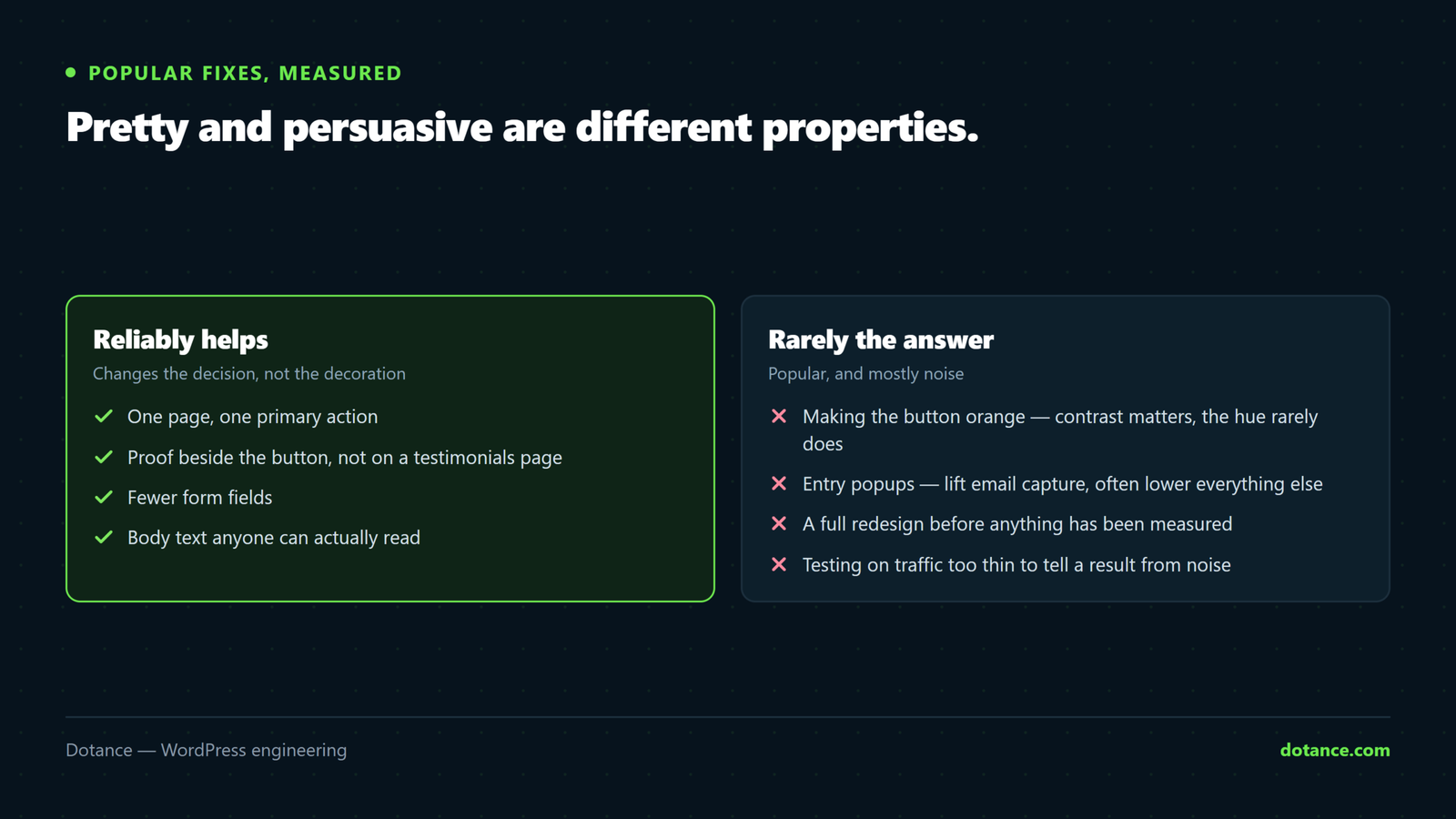
| Popular fix | Reality |
|---|---|
| Making the button orange | Contrast against its surroundings matters; the specific colour rarely does |
| Entry popups | Sometimes lift email capture while lowering the sales the page existed for |
| Countdown timers on evergreen offers | Manufactured urgency costs trust with the people most likely to buy |
| “Above the fold” as a rule | People scroll. Relevance holds attention; arbitrary cramming does not |
| A full redesign | Changes everything at once, so you learn nothing about what worked |
Fix them in this order
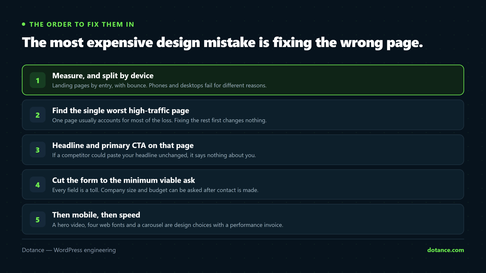
- Measure, and split by device.
- Fix the single worst-performing high-traffic page.
- Headline and primary CTA on that page.
- Form fields — remove everything not needed to reply.
- Proof, moved next to the action.
- Then, and only then, consider anything visual.
Change one thing at a time and give it enough traffic to mean something. The rest of this is what a conversion-focused design pass looks for.
Common questions
How much traffic do I need to test a change?
Enough conversions that the difference is not noise — for most small sites that is weeks, not days. Below that volume, use judgement and best practice rather than pretending you are running an experiment.
Should I A/B test?
Only with the traffic to support it. Under a few hundred conversions a month, sequential changes with honest before-and-after numbers will teach you more than an underpowered split test.
Our bounce rate is high. Is that the problem?
Not on its own. A visitor who reads the answer and leaves satisfied looks identical to one who left in disgust. Pair it with scroll depth and time on page before drawing conclusions.
Is a redesign the answer?
Occasionally. More often it is three specific fixes on two pages. If you do redesign, protect what already works — see redesigning without losing rankings.