How the score actually works
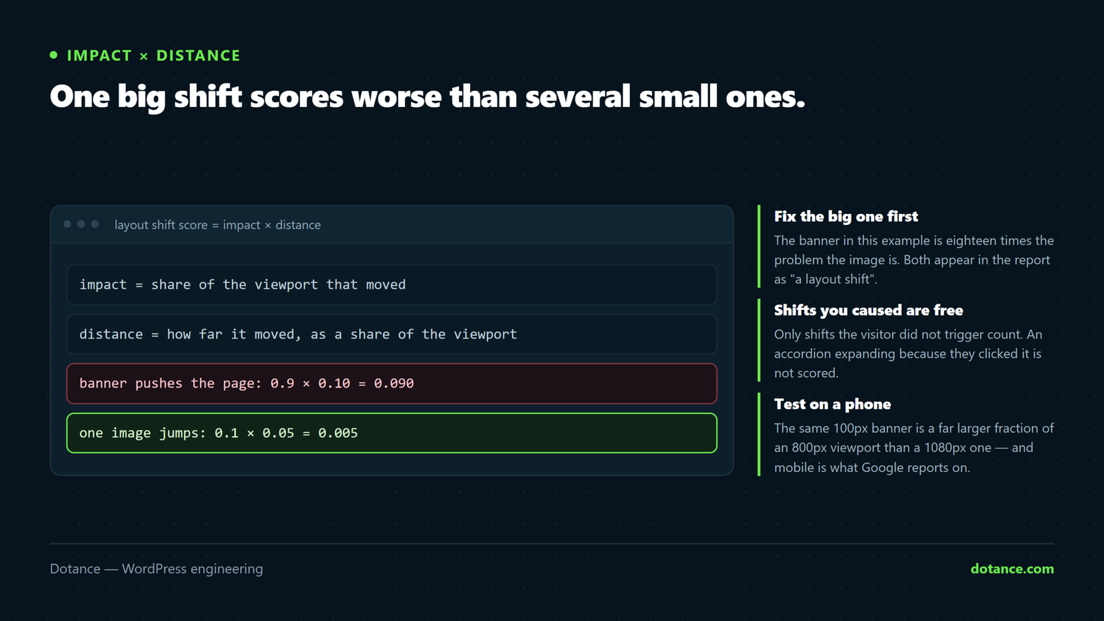
Knowing the formula tells you which shift to fix first.
Layout shift score = impact fraction × distance fraction.
- Impact — how much of the viewport the moving content occupies.
- Distance — how far it moved, as a fraction of the viewport.
A banner that pushes the whole page down 100px on a 900px screen: impact ~1.0, distance ~0.11, score ~0.11 — one element fails the whole page on its own. Meanwhile ten small icons nudging 2px score almost nothing.
So do not fix ten small things. Find the one big one.
Shifts within 500ms of a click or tap do not count. An accordion opening, a menu expanding, a “load more” button — all free, because the visitor caused them. You only need to fix movement that happens on its own.
Find your actual shifts
PageSpeed Insights lists the shifting elements under Avoid large layout shifts. To watch them happen:
DevTools → Performance → tick Screenshots → record a reload. The Experience track shows each shift; click one and Chrome highlights the element and its before/after position.
Or log them live in the console:
new PerformanceObserver((list) => {
  for (const e of list.getEntries()) {
    if (!e.hadRecentInput) {
      console.log('shift', e.value.toFixed(4), e.sources.map(s => s.node));
    }
  }
}).observe({ type: 'layout-shift', buffered: true });
The hadRecentInput check is what filters out shifts the visitor caused — the same rule Google applies.
1. Images without dimensions
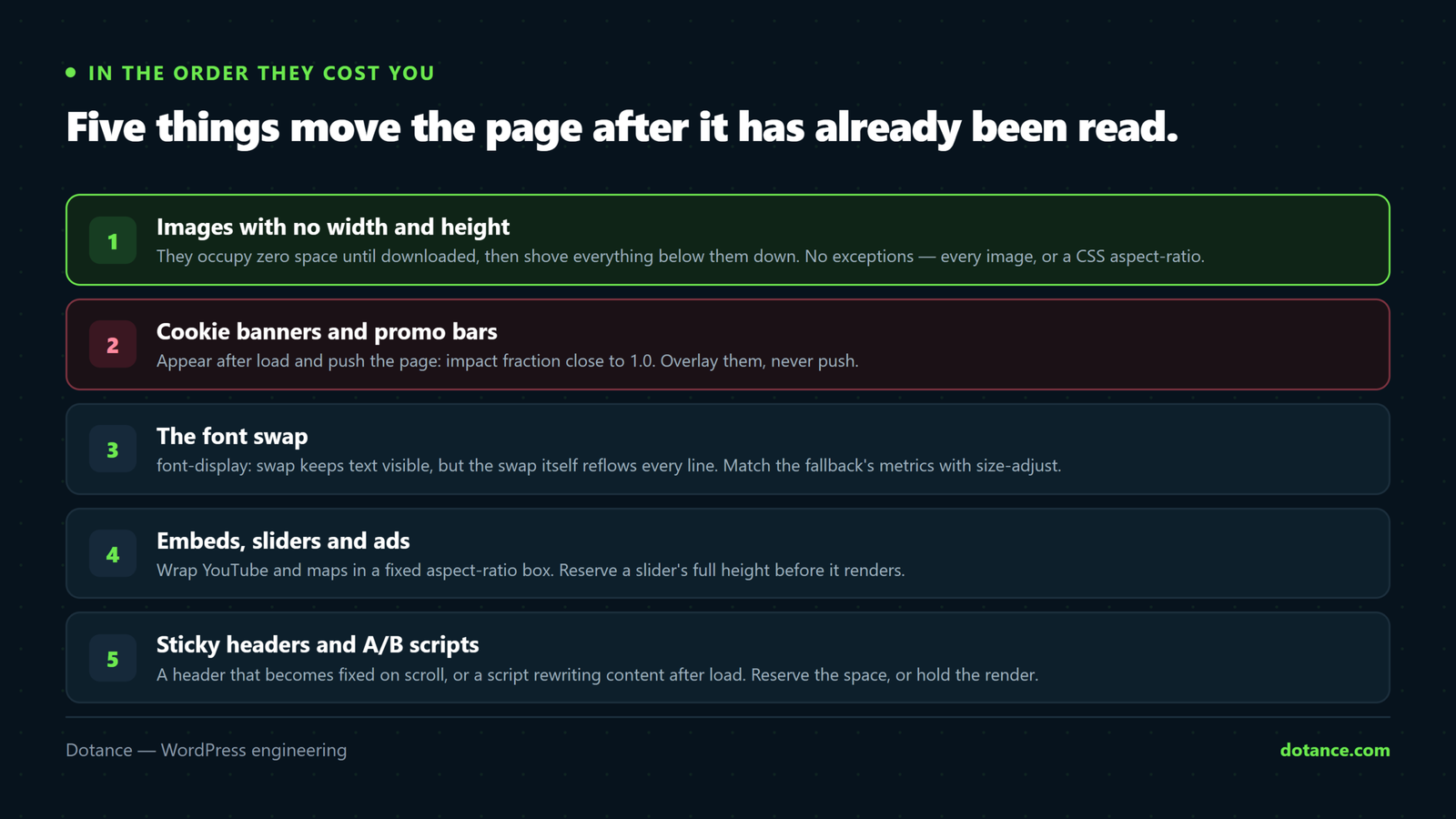
An image with no width and height occupies zero space until it downloads, then shoves everything below it down.
<img src="photo.webp" width="1200" height="800" alt="…">The numbers are the file’s real pixel dimensions, not the display size — the browser uses them for the ratio and CSS still controls the size. Pair with:
img { max-width: 100%; height: auto; }Modern WordPress adds dimensions to content images automatically. What it misses: theme template images, page-builder widgets, hand-written HTML in blocks, and anything injected by JavaScript.
Where you cannot set attributes, reserve the box in CSS:
.hero-media {
	aspect-ratio: 16 / 9;
	width: 100%;
}
2. Cookie banners and promo bars
Anything that appears after load and pushes content is the worst kind of shift, because its impact fraction is close to 1.0 — everything below it moves.
Overlay it, do not insert it. A banner positioned over the page displaces nothing and scores zero:
.cookie-banner {
	position: fixed;
	bottom: 0;
	left: 0;
	right: 0;
	z-index: 9999;
}
If it genuinely must sit in the flow — a top bar, say — reserve its height from the first paint rather than adding it later:
.promo-bar-slot { min-height: 48px; }The slot is empty and 48px tall on load; the bar fills it. Nothing moves.
3. Font swap — the invisible fix
When a web font loads and is a different size from the fallback, every line of text reflows. font-display: swap keeps text visible, but it is the swap itself that shifts.
The real fix is making the fallback the same size as the web font, so the swap changes nothing visually:
@font-face{ font-display:swap;
	font-family: 'Inter fallback';
	src: local('Arial');
	size-adjust: 107%;      /* tune until the swap is invisible */
	ascent-override: 90%;
	descent-override: 22%;
	line-gap-override: 0%;
 }

body {
	font-family: 'Inter', 'Inter fallback', sans-serif;
}
Find the right numbers by loading the page with the web font blocked and adjusting size-adjust until the fallback occupies the same space. Preloading the main weight also shrinks the window in which a swap can happen at all.
4. Embeds, sliders and ads
- YouTube and maps — wrap in a fixed aspect-ratio container so the iframe cannot resize the page.
- Sliders that render at one height then resize — reserve full height up front, or replace them. They are a conversion dead-zone anyway.
- Ad slots — give every slot a
min-heightmatching its most common creative. An unfilled slot that collapses is also a shift.
.video-embed {
	aspect-ratio: 16 / 9;
	width: 100%;
}
.video-embed iframe {
	width: 100%;
	height: 100%;
	border: 0;
}
5. The ones people miss
| Cause | Fix |
|---|---|
| Sticky header that becomes fixed on scroll | Reserve its height in the flow, or make it fixed from the start |
| A/B test or personalisation script rewriting content | Hide the region until it resolves, with a reserved-height placeholder |
| Scrollbar appearing when content grows | scrollbar-gutter: stable on html |
| Icon fonts loading late | Use inline SVG instead |
| Admin bar on logged-in views | Not counted for visitors — test logged out |
Verify properly
Test on mobile. CLS is far worse on narrow screens: the same 100px banner is a much bigger fraction of an 800px viewport than a 1080px one, and mobile is what Google reports on.
And measure the whole visit, not the first screen — CLS accumulates as you scroll, so scroll the page while recording. A page that scores 0 at the top can fail badly once lazy-loaded images start arriving.
Finally, judge on Search Console → Core Web Vitals, not a Lighthouse run. Field data is what counts, and it lags a few weeks behind your fix.
Common questions
Lighthouse says CLS 0 but Search Console says it is failing.
Lighthouse measures a single load with no scrolling. Real visitors scroll, and shifts further down the page count too.
My accordion shifts the page. Does that count?
Not if the visitor clicked it and the shift happens within 500ms. Self-opening ones do count.
Does lazy loading cause CLS?
Only when the image has no reserved space. With width and height set, lazy loading is fine — and good for LCP everywhere except the hero.
I fixed everything and the score has not moved.
Field data updates on a 28-day rolling window, so it moves gradually. Confirm the fix in DevTools immediately; wait for Search Console to catch up.