
Sidenotes in the margin
A block style on paragraphs, quotes, images, lists and groups. Pure CSS: no JavaScript, no layout shift, and an honest fallback that puts the note back in the column on a narrow screen.
★ Free block theme
A free WordPress theme for writers, essayists and anyone whose site is mostly words. Notes sit in the margin beside the sentence that prompted them instead of at the foot of the page. The archive is an index rather than a card grid, so a post list reads well with no images at all. Four style variations, ten patterns, six typefaces served from your own site — and not one plugin required.
Overview
Almost every block theme for blogs is the default theme with different colours: one centred column, a grid of cards, and a featured image doing all the visual work. Marginalia is built for sites that are mostly text, so it puts the page's second voice where a book puts it — in the margin.
Give any paragraph, quote, image, list or group the Sidenote block style and it moves out beside the text it follows, where it can be read without leaving the line you are on. Narrow the window and it steps back into the column with a rule down its left edge. Nothing is hidden, nothing is numbered and nothing has to be clicked.
Who it is for
It suits a particular kind of site very well and others not at all. Worth knowing which you are before you download.
If your posts run to a thousand words and carry asides, references and second thoughts, the margin is where those belong. The reading column is set to a comfortable measure and you can narrow or widen it in one setting.
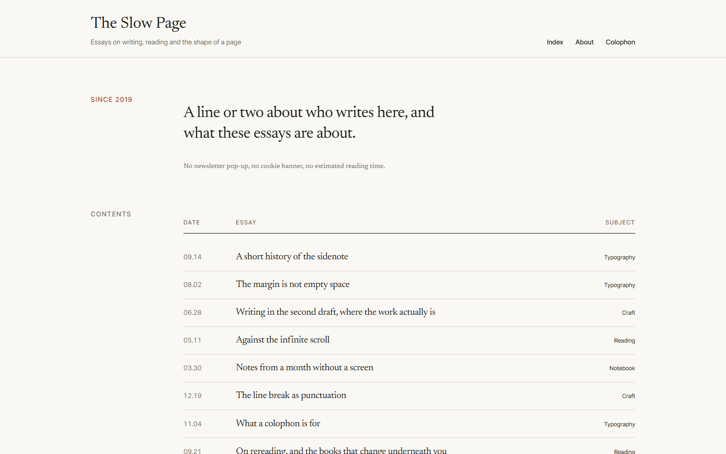
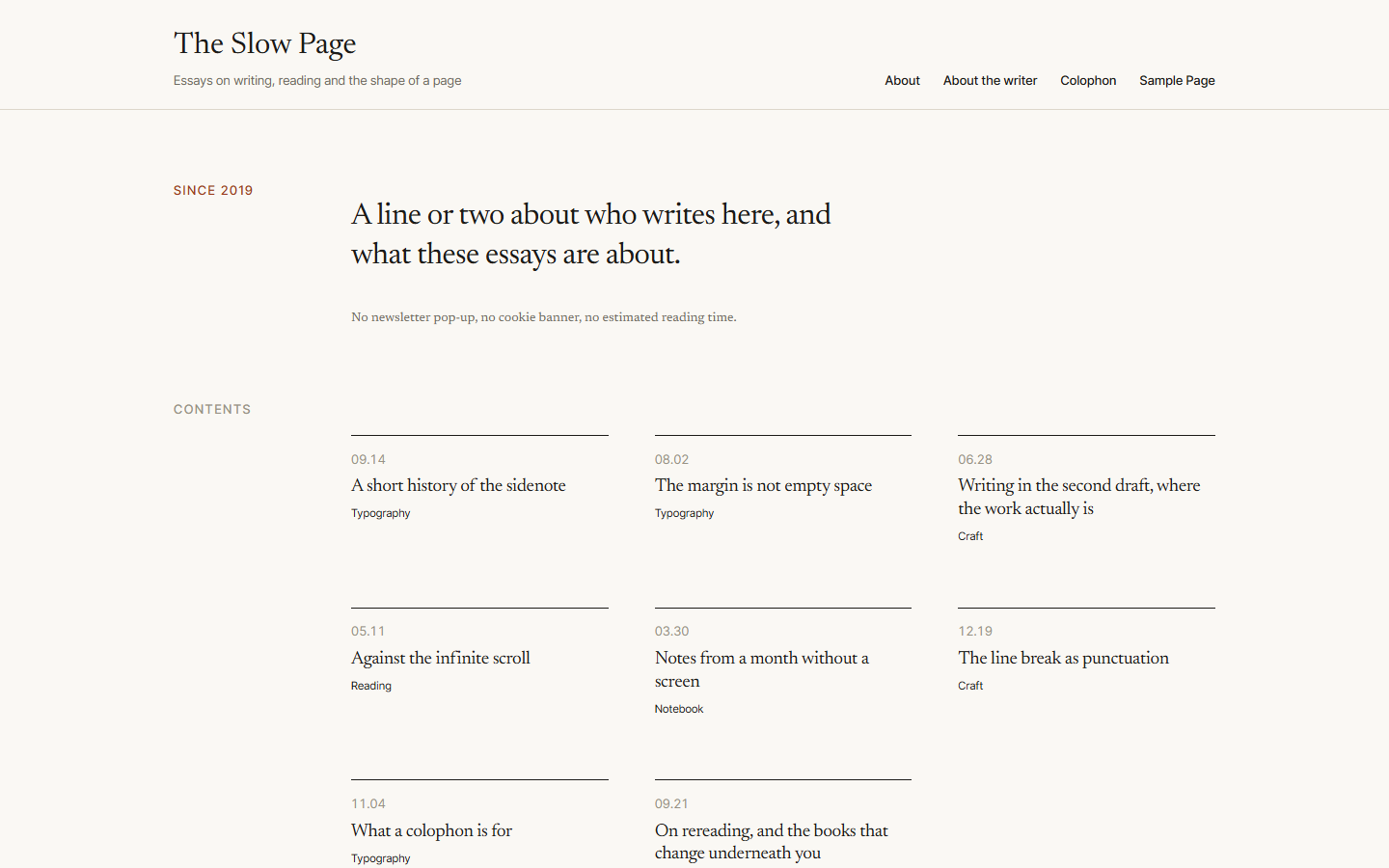
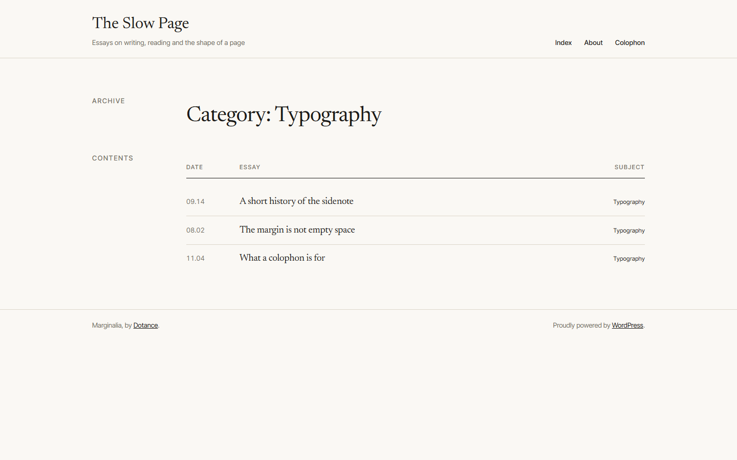
The index lists every piece by date, title and subject on one hairline-ruled row. It reads like the contents of a book and needs no featured images, which is how most writing archives actually look.
A sidenote costs the reader nothing to reach, so you can afford to write more of them. No footnote markers to chase, no tooltips to hover, no accordions to open.
There is no WooCommerce styling, no slider, no mega menu and no page-builder integration. If you need those, one of the big multipurpose themes will serve you better than this one.
Sidenotes
No setup wizard, no demo import and no plugin to install first.
Features
A block style on paragraphs, quotes, images, lists and groups. Pure CSS: no JavaScript, no layout shift, and an honest fallback that puts the note back in the column on a narrow screen.
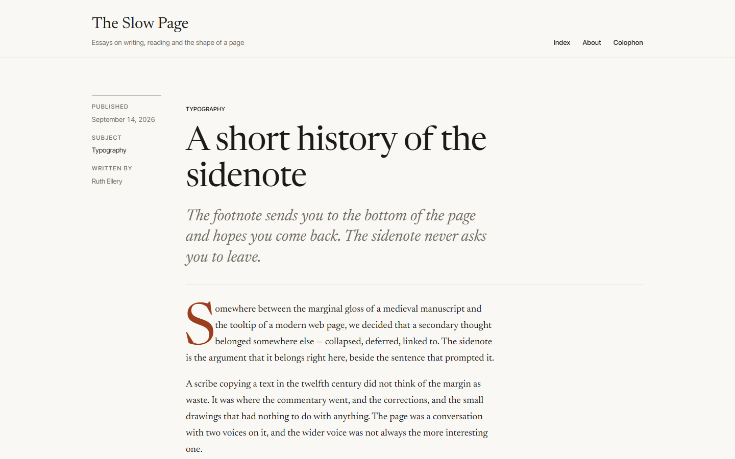
Date in tabular figures, title, subject, hairline rule. A post list that reads as a designed page with zero featured images — or switch it to a grid of cards in one setting.
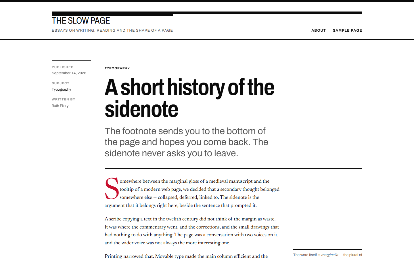
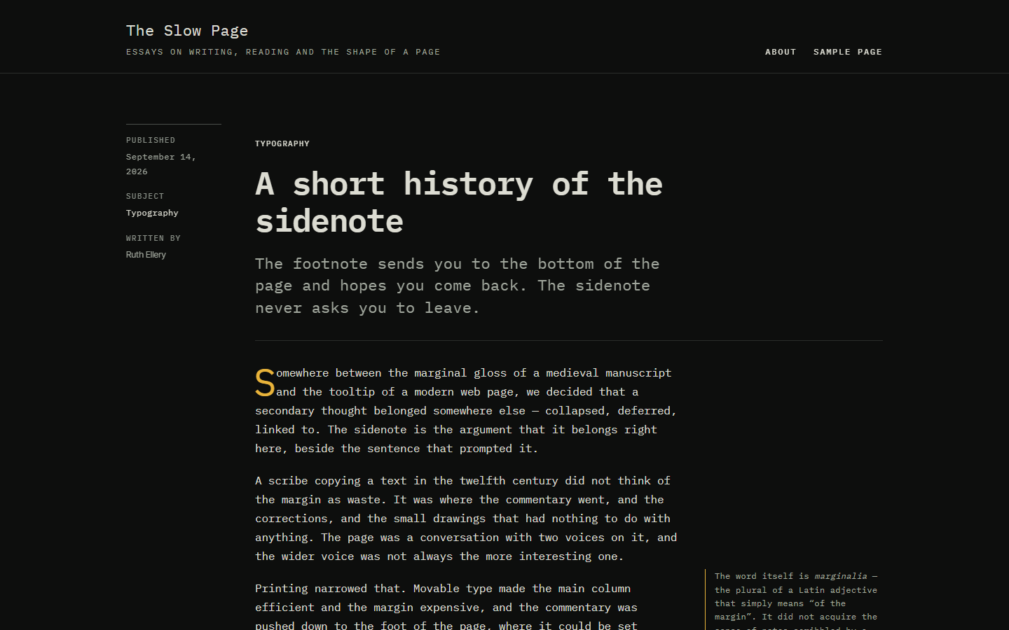
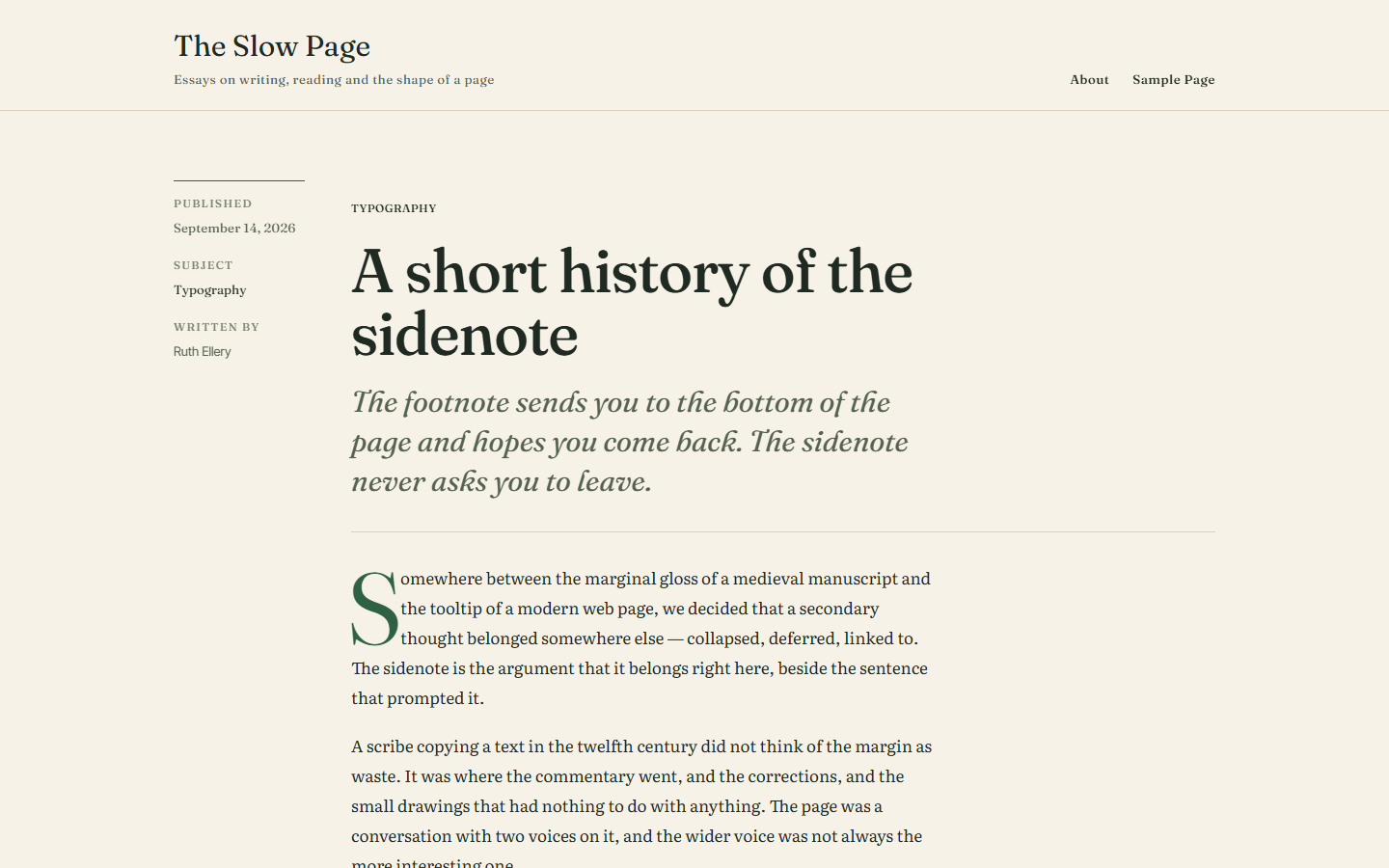
Marginalia on warm paper, Press as a newspaper with condensed headlines, Terminal in monospace on near-black, Letter letterpressed on cream. Each changes the type, the scale and the rhythm.
Published, subject and author run down the left of an essay and scroll with it, instead of crowding the headline.
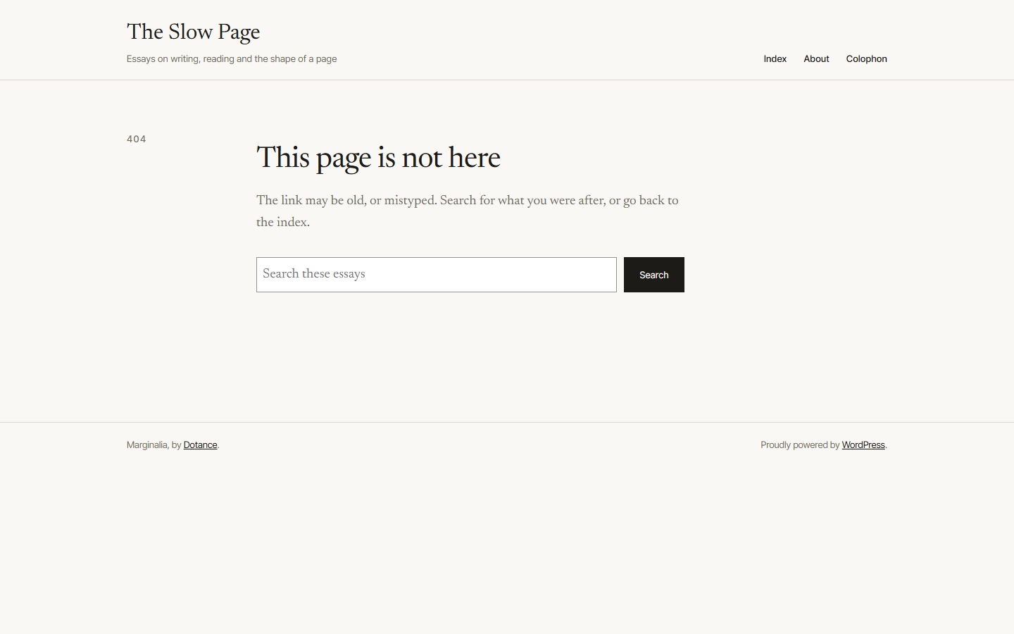
Two headers, a footer with a colophon line, the index, a grid, an about page, a colophon page that credits your typefaces, a sidenote, a pull quote and a follow section.
Newsreader, Inter Tight, Archivo, IBM Plex Mono, Fraunces and Literata ship inside the theme and are served from your own domain. No request goes to Google or anywhere else.
No axe violations across six page types in all four variations, every text colour at 4.5:1 or better, a skip link, visible focus and reduced-motion support.
Core blocks only. No custom post types, no shortcodes, no upsell and nothing to install alongside it. Your content stays portable if you switch themes.
Buyer’s guide
Start with the measure. A line of text should run about 60 to 75 characters before it wraps; much longer and the eye loses its place on the return sweep. Most multipurpose themes let the column fill whatever width it is given, which is comfortable for a landing page and tiring for an essay.
Then look at what happens to an aside. A footnote sends the reader to the bottom of the page and hopes they come back; a tooltip hides the thought behind a hover that phones cannot do. A note in the margin is read almost at the same time as the sentence it belongs to, because the eye already takes in what sits beside the line.
Check where the fonts come from. A theme that loads Google Fonts makes every visitor's browser connect to another company before your words appear, which is slower and, in the EU, a question your privacy policy has to answer. Bundled fonts avoid both.
Finally, see what the archive looks like with no images. Most writing sites have few or none, and a card-grid archive built around featured images collapses into a column of grey rectangles without them.
Download freeCompare
Not better at everything — better at one thing, and honest about the rest.
Multipurpose themes import dozens of demo sites and hundreds of options, most of which you delete. This one ships eight templates and ten patterns, all for the same kind of site.
A style variation here changes the typeface, the type scale, the spacing rhythm and the rule weight — not the palette with everything else held still.
No Pro version, no locked patterns, no licence key and no annual renewal. GPLv2, the whole thing.
No companion plugin, no page builder and no framework. If you switch away later, your posts are still ordinary core blocks.
Screenshots
Price
Free
The whole theme. No Pro version exists.
Quoted
We set it up, move your posts across and write the patterns you need.
Let’s talk
A theme of your own, built the way this one was.
GPLv2 or later. Use it on as many sites as you like, change anything you want, and keep whatever you build with it.
Changelog
First release. Eight templates, four style variations, ten patterns and the Sidenote, Index list, Grid and Rail block styles. No axe violations across six page types in all four variations, and every text colour at 4.5:1 or better on its background. Six typefaces bundled and served from your own site.
More from Dotance
We would like to use analytics cookies to understand how the site is used. They are not needed for the site to work, and nothing is loaded unless you agree. Privacy policy